

An “industrial block” can be good quality architecture too
Evidence, that good architecture endowed with top quality design don’t need to be connected exclusively with a residential or administrative project, but it can equally well apply to industrial architecture, can provide without any doubt also a manufacture and operational building of ETIS Slovakia, designed by architect Andrej Alexy of Bratislava ALEXY&ALEXY studio. Building built at the classical “industrial” rectangle ground plan is situated in municipal area of Bratislava – Vrakuňa not far from the water treatment plant. This actually concerns an decentralised municipal location at the end of the family houses area where starts a zone of manufacture and operational objects, divided by a poplar alley from the above mentioned water treatment plant.
The Steel Construction Contrast
 Building of the firm Etis which deals with food
labels and wrappings is located along the narrow estate with area of 11 000 m2.
The built-up area includes 2 000 m2, out of which 600 m2 belongs to
administrative departments situated on two floors. Construction is made of steel
with span of 3.6×9 metres; in manufacture hall it is 22 metres with wide span
(but tiny) partition beams and no columns were used.
Building of the firm Etis which deals with food
labels and wrappings is located along the narrow estate with area of 11 000 m2.
The built-up area includes 2 000 m2, out of which 600 m2 belongs to
administrative departments situated on two floors. Construction is made of steel
with span of 3.6×9 metres; in manufacture hall it is 22 metres with wide span
(but tiny) partition beams and no columns were used.
Considering function of this industrial object, the author admits its “I”-form construction; he wouldn’t try to conceal it, right contrary – he emphasizes it through the precisely elaborated details (as for example galvanized nuts that are in contrast with anthracitic colours of the construction itself), and so achieving a very pleasant visual effect that he further makes up with filling materials such as clear glass, MDF plates, cetris plates or galvanized grids.
Harmony of premises, materials and colours
Placed asymmetrically – in the third of the ground plan – is the entrance. The whole entrance façade front is of glass covering both floors. Providing therefore an ideal opportunity to communicate with the surroundings comprising in the first plan of alley of trees. It is a pleasant experience for employees of administrative department that is situated in this front section but also for the visitors and clients of the firm.
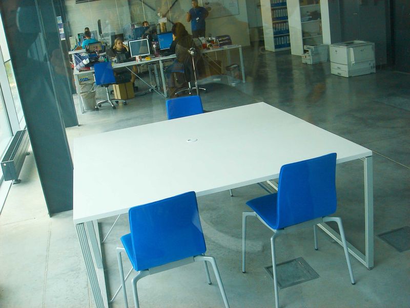
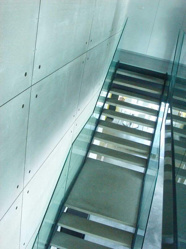
The main entrance was designed really generously and executed over two stores with the reception vis-a-vis. From other premises it is divided by glassed-in walls – there is the client reception situated on the left together with the graphic studio and on the right we can find a small meeting room. In the rear part there is a kind of hinterland – a kitchen niche and a mini dining hall for employees. Between those two spaces (behind the reception counter) there is staircase leading to upper floor. The staircase is at the same time a noticeable design point – anthracitic steel construction with concrete steps and glass banister provides contrast for the neutral light grey „cetris” background.
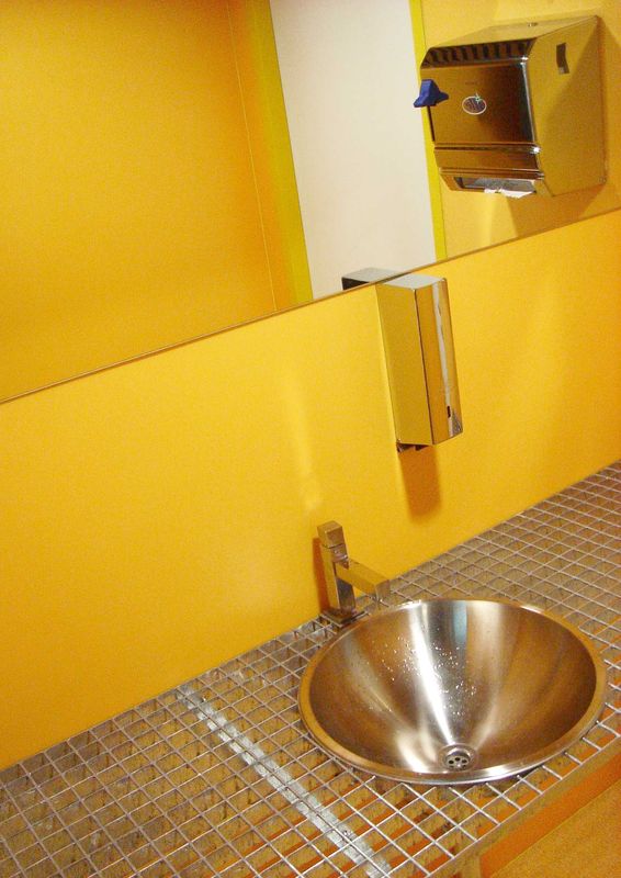
Architect Alexy handled his task really as a complex issue to the detail including the colour solution. Therefore the dining room premises at the ground floor are yellow making the grey shades in the entrance area livelier. Nicely distilled into premises are colourful furniture points situated on a blanket poured floor – chairs with the blue upholstery combined with white office furniture – working desks and shelves. Firm Management seat is situated at the second floor together with the economy department and in the smaller part is the “bosses” meeting room with contrasting red chairs. Here, anthracite wall divides office premises. Behind it are sanitary premises (in fresh yellow shades too) and a “delicacy” in a form of galvanized grate or a counter with washbasin. This merely shows that the architect pulled out all the stops right down to the very last detail.
Managed to extract maximum out of minimum
From entrance directly to the production (one door will do). Here is earmarked the pedestrian “communication” from which it is possible to enter the background, the production and storage. In the manufacturing part are installed technologies necessary for the production. This part of the building gives a stern architectonic impression, however, people do not perceive it in this way, as all the used materials as well as all colours are perfectly harmonised.
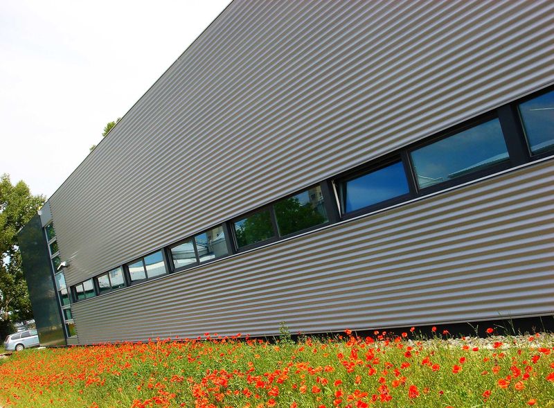
So, what is the trick, how it is all “wrapped”? Maybe it would seem that it is a kind of impressive wrapping produced by the investor – owner of the firm. However, this is not so and it doesn’t matter. Also “wrappings” for this building Alexy designed functionally and clearly. He actually managed to get maximum out of minimum. He inserted supporting aluminium profiles into the abovementioned glassed-in entrance part and the attic and the sidewalls (up to the screed dividing administration from the production) he covered with anthracite alucobond plates. Alexy covered the perimeter wall of production hall with light grey corrugated aluminium sheets and brightened it with line of windows. The panelling construction comprises here of classical sandwich panels (sheet metal – insulation – sheet metal). The exterior arrangement at the entrance made of white jackstones and two steps covered with sheet metal makes also an clean and decent impression.
As Alexy said at the beginning of inspection, it was almost a sample project as cooperation with the investor is concerned who encouraged him to continue with this concept as soon as he saw the first five sketches. In the end it is therefore necessary to say that though it would always be a block, an ordinary production building can also become interesting and good quality architecture. Such result is fruit of an optimal cooperation between the “illegitimate triangle” comprising of architect – investor – supplier. In the end everyone successfully succeeded; and after six months of the construction and following overall costs amounting to EUR 2 000 000 is building finally in operation. And the fact, that architect managed to harmonize all the tones into a single consonant and harmonious chord is this time really obvious. And even the field poppies along the building look as if designed as a park arrangement…
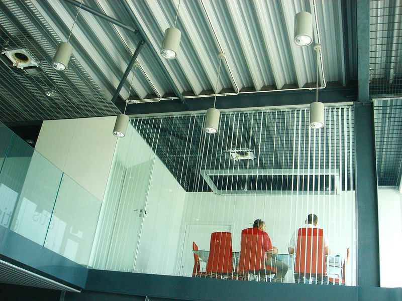
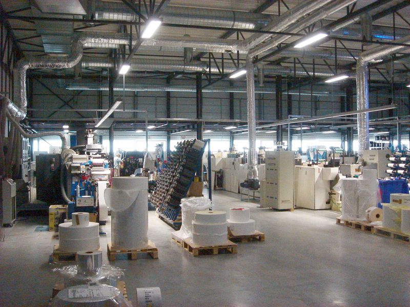
Photo – author
1 – Industrial entrance portal
2 – Summer contrast: corrugated aluminium sheets vs. field poppies
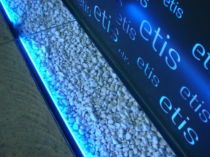
3 – Spectacularly spotlit reception counter at the entrance
4 – Clients reception and graphic department near the entrance
5 – Constructionally and materially lightened staircase area
6 – Interesting colour and material solution of sanitary area
7 – Conference Hall situated on upper floor
8 – Unrestricted layout of production premises without pillars
 Jagg.cz
 Linkuj.cz
 Google Bookmarks
 Live bookmarks
 Digg
Digg Del.icio.us
 MySpace
 Facebook